Image
Description
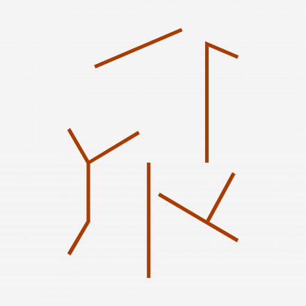
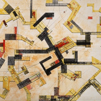
Grundriss New Babylon über Slotermeer, ca 1961

Constant Change is a publication by Spector Books, whose publishing practice is settled in the intersection of art, architecture, theory, and design, based in Leipzig Germany.

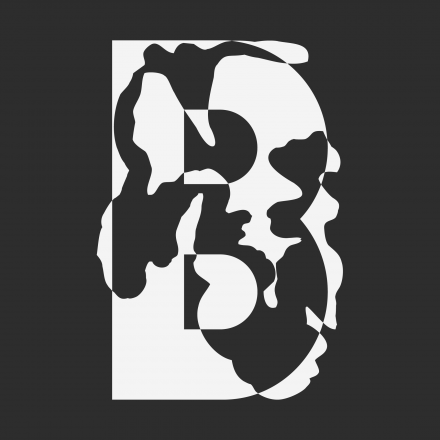


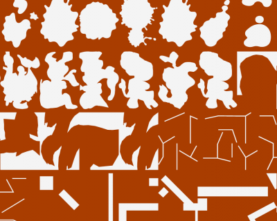
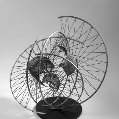
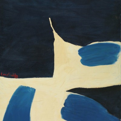
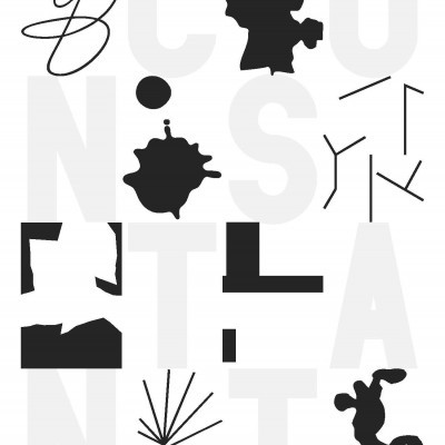
Dutch artist and sculptor Constant Nieuwenhuys a.k.a. Constant (1920–2005) is known for the great breadth of his work, which ranges from painting to music. This year he would have celebrated his 101st birthday. The graphic designers at Our Polite Society have used his artistic works as a basis for creating a typeface called Constant Change.


It includes six cuts, each containing the twenty-six letters of the alphabet. Moving playfully through the alphabet, the typographic designs draw on some 100 works from Constant’s collection. The publication makes use of the tools of typography in a contemporary approach to historical works of visual art, while revealing the sources that inform the designs. Constant Change is accompanied by a text by Paul Gangloff.